Late Game 2 Postmortem
It's been nearly a month since this was uploaded and that's because life was kind of crazy for all of July. That said, this game was a lot of very good, hard lessons on game dev.
First, I wanted to make a bigger game, to make up for Game 1, An Old Nightmare, being a *single room* more than one person who put up gameplay videos of it (thank youu!) tried to leave the room after winning that one. Sorry, that's all there was to it! See with that game, I was still learning boring issues, like how to make models in Blender, and import them into Unity. Basic scripting, basic controls. I think the desire to put these skills to use since they weren't a challenge anymore AND to one-up myself lead to this game being WAY too ambitious.
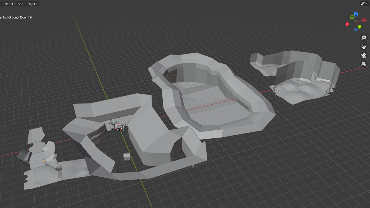
Most of April was spent modeling the level, struggling with seven or eight false starts at a level map, still barely understanding my tools in a lot of tiny ways. It's like how if you are cleaning the floor of a room, doing all the corners and edges takes almost as long as doing the open middle part, because they're much more particular than the more open area, or the more general-purpose tools.

I started thinking about my level separated into "rooms" that were defined by the player's vision. All my reading on level design emphasized the painting and photography concept of composition. Have a "star" asset that is unique and prominent to draw the eye and help the player position themselves in the world, while "backup dancer" assets can be repeated, and be simple, to help sell the tangibility of the world. The Star assets help define the "room" in the player's head, while the Backup assets bring the scene together aesthetically.
The whole time I was modeling I was doing so without any mind towards texturing, which was a bad idea. Do NOT model everything, then texture everything, then pull the assets all into the game engine, because then you front-load design work that might need to be redone when you see it in game. By the time I was opening Unity to start experimenting with shaders, I was already starting to be pressed for time. Making things even worse, I crossed the threshold artists know too well, of having put in enough practice to improve. Meaning, you now hate all of your old work and want to redo it. It wasn't until the last few models that I actually knew how to model. It wasn't until the last few textures that I knew how to actually UV unwrap. I had to stay on schedule though, these projects only get three months each, and it was nearly the end of May before I started making the actual GAME part of the game.
As I started to build the space, I more and more kicked myself for making too few textures, having to go back and made assets that I didn't realize I'd need. The contrast between my first few models/textures and my last few enough to make you doubt the same person made them all. Scenes have clashing color schemes, objects have inconsistent textel density, there's probably holes in the world that I just covered up with a rock, and a few patches of grass floating an inch off the ground. Too many things were bespoke in the worst way.
The UI was a particular bugbear for me. There seem to be special, unspoken rules about how UI handles visibility, depth, and interactivity because it was a hassle for the longest time. Working through my scripting, slowly, I was eventually able to get code that worked and made sense to read as opposed to the collage of other people's code that was the whole script of Game 1. Did you know that the ENTIRE code of Game 1, almost, was just jammed into the player control script? Don't do it that way! It sucks, lol.
The time frame was aggressive enough that I found my plans for the game were far too ambitious, just like everything else, for my skill level and time frame. The monster I concepted for this project ended up cut. I was forced into the position of cutting features, or pulling the kind of work schedule that would make my loved ones worry that I might have died.
What I learned, mainly, is to not be over-ambitious. Game 3 is due by the end up September and I am very deliberately making it something that is much smaller in scope, but hopefully it is actually finished and more polished than this. Thanks to everyone who gave feedback!
Files
Get In the Soil
In the Soil
You're sent to investigate a farm abandoned under strange circumstances
| Status | Released |
| Author | Gargoyle House |
| Tags | Horror, Low-poly, Short, Singleplayer |
| Languages | English |
Leave a comment
Log in with itch.io to leave a comment.